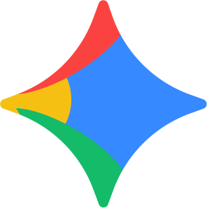


Google has officially started rolling out its new gradient-based icon design across multiple apps, signaling one of the biggest visual branding shifts in recent years. From Google Gmail and Google Drive to Maps and Gemini, the company is evolving from flat color blocks into fluid, AI-inspired gradients.
At first glance, the redesign may appear subtle.
But behind this update lies a much bigger transformation:
- AI-first branding
- Adaptive visual identity
- Emotional interface design
- Better usability
- Modern digital scalability
- Future-ready brand systems
For businesses, designers, startups, and marketers, Google’s redesign is more than a logo update.
It is a blueprint for the future of branding.
Why Google Changed Its Icon Design
Google’s previous icon system focused heavily on:
- Flat design
- Geometric simplicity
- Hard color separation
- Minimal gradients
However, modern digital ecosystems are changing rapidly because of AI.
The company is now expanding gradient-based visuals across more apps to align with its AI-driven future.
The redesign introduces:
- Smoother transitions
- Softer edges
- Layered gradients
- Modern visual depth
- More emotionally engaging interfaces
This shift reflects Google’s larger design evolution toward:
- AI experiences
- Adaptive interfaces
- Human-centered digital interaction
The Real Meaning Behind Google’s Gradient Design
Gradients Represent Intelligence
Modern tech companies increasingly use gradients because gradients psychologically communicate:
- Movement
- Adaptability
- Intelligence
- Creativity
- Fluidity
Flat colors feel static.
Gradients feel alive.
That is exactly why companies building AI ecosystems are moving toward:
- Layered visuals
- Fluid lighting
- Dynamic color systems
- Motion-friendly branding
Google’s new design language strongly mirrors the visual identity used in:
- Google Gemini AI
- AI assistants
- Generative interfaces
- Modern neural UI systems
This redesign reflects the evolution of branding in the AI era.
Google’s New Icons Improve User Experience
Most people think logo redesigns are only about aesthetics.
They are not.
This redesign also solves major usability problems.
Previously, many Google Workspace icons looked too similar:
- Gmail
- Drive
- Meet
- Calendar
- Docs
Users often struggled to quickly identify apps.
The new redesign focuses on:
- Distinct shapes
- Differentiated colors
- Clearer visual hierarchy
- Lower cognitive load
This dramatically improves:
- App recognition
- Navigation speed
- Accessibility
- Mobile usability
Modern logo systems must support usability as much as visual appeal.
The Rise Of AI-Era Branding
Traditional logos were designed mainly for:
- Billboards
- Static screens
Modern logos must work across:
- Smartphones
- Smartwatches
- AI assistants
- Voice interfaces
- App icons
- Dynamic UI systems
- AR/VR experiences
This changes everything.
Today, a successful logo must be:
- Scalable
- Interactive
- Emotionally engaging
- Minimal
- Animation-friendly
- AI-compatible
Google’s new icon system reflects all of these principles.
The Psychology Behind Gradient Branding
Gradient logo design is becoming popular again because gradients create:
- Emotional depth
- Premium perception
- Better digital aesthetics
- More immersive experiences
Color transitions naturally feel:
- Softer
- Smarter
- More futuristic
- More dynamic
In branding psychology:
- Flat colors create stability
- Gradients create movement and innovation
That emotional difference matters enormously in modern digital branding.
Especially in AI products, brands want users to feel:
- Curiosity
- Intelligence
- Innovation
- Trust
- Human-like interaction
Gradients help achieve those emotions visually.
Flat Design vs Gradient Branding
Flat Design Advantages
- Clean appearance
- Minimal distractions
- Simple scalability
- Easy recognition
Gradient Branding Advantages
- More depth
- Better emotional connection
- Modern AI aesthetics
- Motion-friendly visuals
- Premium visual feel
Flat design dominated the mobile-first era.
Gradient branding is dominating the AI-first era.
Why Modern Brands Are Moving Toward Adaptive Branding
Modern users interact with brands differently today.
A logo now appears on:
- Mobile apps
- Smart devices
- AI search interfaces
- Social media
- Websites
- Wearables
- Digital dashboards
Because of this, branding systems must adapt dynamically.
This is called adaptive branding.
Adaptive branding allows logos to:
- Scale intelligently
- Animate smoothly
- Work across multiple interfaces
- Maintain recognition everywhere
Google’s redesign is a perfect example of adaptive logo evolution.
What Businesses Can Learn From Google’s New Logo Design
1. Small Changes Create Massive Impact
Google did not completely redesign its identity.
Instead, it improved:
- Color transitions
- Softness
- Visual flow
- Modern depth
The structure remained recognizable.
This is smart branding strategy.
Businesses should understand:
You do not always need a complete rebrand.
Sometimes strategic refinement creates stronger results.
2. Your Logo Must Be Mobile-First
Most brand interactions now happen on smartphones.
Your logo must look perfect on:
- App icons
- Favicons
- Instagram profiles
- YouTube thumbnails
- AI interfaces
- Smartwatch screens
If your logo becomes unreadable at small sizes, your branding is already outdated.
Google’s redesign proves modern logos must prioritize:
- Simplicity
- Scalability
- Recognition speed
3. Future Branding Is Emotion-Driven
Modern users emotionally connect with:
- Visual depth
- Soft gradients
- Fluid motion
- Immersive UI systems
This is why major companies are shifting toward:
- Softer interfaces
- Layered branding
- Motion-first identity systems
The future of branding is no longer purely functional.
It is experiential.
Future Logo Design Trends
Google’s redesign confirms several major branding trends for the next decade.
Future Branding Trends Include:
- Gradient logo systems
- AI-inspired visuals
- Adaptive branding
- Motion-first identities
- Simplified geometry
- Emotion-focused interfaces
- Dynamic color transitions
- Responsive visual systems
Businesses ignoring these trends risk appearing outdated.
Why Businesses Should Modernize Their Branding
An outdated logo can make even a great business feel less trustworthy.
Modern branding helps businesses:
- Build credibility
- Increase recognition
- Improve customer trust
- Enhance digital presence
- Stand out competitively
A modern logo should:
- Be memorable instantly
- Scale across devices
- Feel premium
- Support digital marketing
- Adapt to future technologies
Branding today is not just design.
It is business positioning.
Expert Branding Insight
The biggest lesson from Google’s redesign is simple:
The future of branding belongs to systems that feel alive.
Modern logos are no longer static symbols.
They are becoming:
- Interactive experiences
- Emotional touchpoints
- Intelligent visual systems
As AI becomes more integrated into everyday life, branding will continue evolving toward:
- Adaptive visuals
- Dynamic interfaces
- Human-centered experiences
Businesses that modernize early gain a massive competitive advantage.
FAQ
Why Did Google Redesign Its Icon?
Google redesigned its icon to align with modern AI-first branding, improve usability, create better app recognition, and modernize its visual identity for future digital platforms.
What Is Gradient Branding?
Gradient branding uses smooth color transitions instead of flat solid colors to create depth, emotion, and a more modern digital appearance.
Are Gradient Logos Good For Businesses?
Yes. Gradient logos can create a premium, modern, and emotionally engaging brand perception when designed correctly.
Is Flat Design Outdated?
Not completely. Flat design still works well for simplicity and minimalism, but many brands are now combining flat principles with gradients for better emotional impact.
What Are The Future Logo Design Trends?
Future logo design trends include:
- AI-inspired branding
- Adaptive logo systems
- Motion-friendly identities
- Gradient visuals
- Simplified geometry
- Responsive branding systems
How Can Businesses Modernize Their Branding?
Businesses can modernize branding by:
- Simplifying logo structure
- Improving scalability
- Using modern typography
- Adopting adaptive design systems
- Creating mobile-first branding
What Makes A Logo Future-Ready?
A future-ready logo is:
- Scalable
- Minimal
- Memorable
- Responsive
- Emotionally engaging
- Compatible with digital ecosystems and AI interfaces
Final Thoughts
Google’s new gradient icon design is not just a visual refresh.
It is a signal of where digital branding is heading.
The redesign reflects:
- AI transformation
- Emotional design
- Usability optimization
- Adaptive digital identity
- Future-focused branding systems
For startups, creators, and businesses, this is an important reminder:
Your logo is no longer just a symbol.
It is an experience.
Businesses that modernize branding early will gain stronger recognition, trust, and competitive positioning in the AI-driven digital future.
Need A Future-Ready Logo Design For Your Brand?
Your business deserves a logo that feels:
- Premium
- Memorable
- Scalable
- Modern
- AI-ready
At Jootoor Designs, we create strategic logo identities built for the modern digital era.
Whether you need:
- Startup Branding
- Business Logo Design
- Logo Redesign
- Premium Brand Identity
- AI-Era Visual Branding
our team helps businesses build timeless and modern branding systems that stand out.