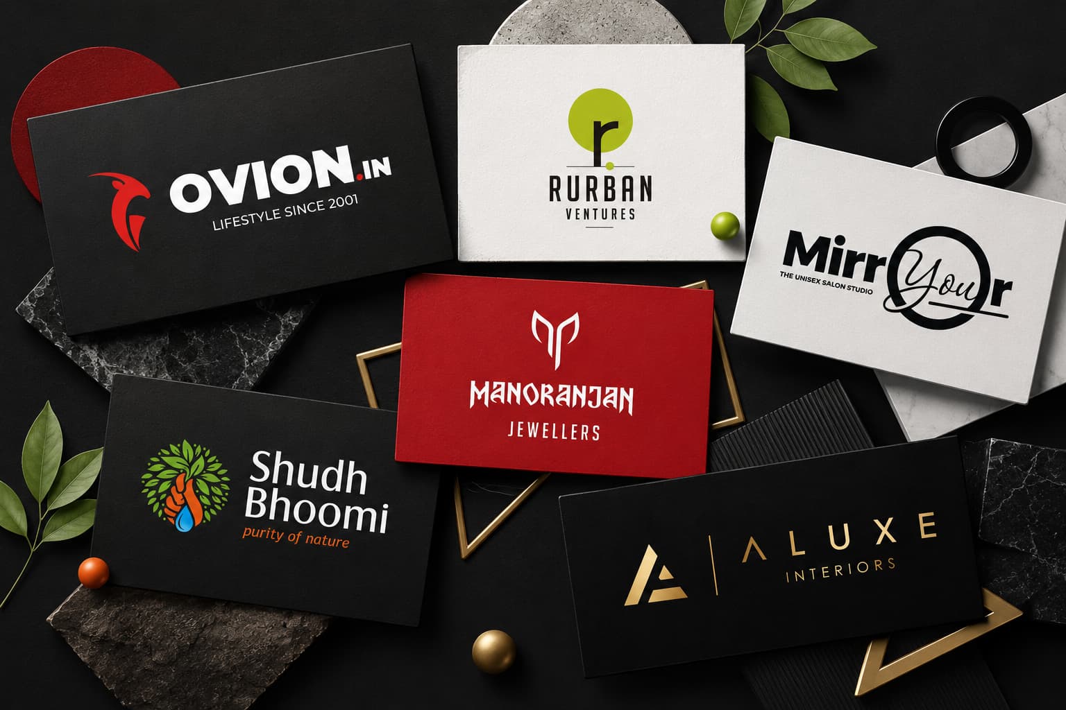
The Power of Logo Colors in Branding
Choosing the right colors for your logo is a crucial step in creating a brand identity that people will remember. The colors you choose do more than just make your logo look nice—they also convey emotions, influence people’s subconscious thoughts, and help you stand out in a competitive market. Whether you’re using Orange to represent creativity, Yellow to evoke optimism, Green to promote eco-friendliness, or Blue to establish trustworthiness, each color has its own meaning and can shape how people perceive your brand.
🔗 Get Started Today | 📞 Contact Us | 💡 Explore Our Portfolio
Why Logo Colors Matter:
- Instantly communicate your brand’s personality and values.
- Boost brand recognition, making your business easier to recall.
- Influence perceptions and decisions within seconds.
Color psychology plays a direct role in this process. For instance:
- Purple is often seen as luxurious or playful.
- Pink communicates approachability or innovation depending on shade.
- Even neutrals like gray or black add sophistication and versatility.
“Colors speak louder than words. The right combination can build trust and create emotional connections with audiences.”
This logo colors cheat sheet breaks down the meanings behind popular shades such as Orange, Yellow, Green, Blue, Purple, and Pink—along with practical advice from branding experts like Jootoor Designs. You’ll learn how to leverage color strategically to reinforce your messaging and ensure your logo works across different industries and cultures. Expect clear guidance on choosing colors that resonate with your target audience while maintaining consistency for lasting brand impact.
Understanding Logo Colors and Their Meanings
Logo colors play a crucial role in shaping how audiences perceive and emotionally connect with your brand. Every color evokes distinct feelings, associations, and expectations—often before a single word of your message is read. This immediate impact makes the choice of logo colors much more than an aesthetic decision; it’s a strategic tool to communicate your brand’s values, personality, and positioning within a competitive space.
How Color Influences Perception and Emotions
The meanings behind colors are deeply rooted in both psychological responses and cultural contexts. When you select a color for your logo, you’re not just picking a shade—you’re triggering emotional cues that can influence buying decisions, trust levels, and memorability. For a deeper understanding of this phenomenon, you can explore the psychology of color in branding.
Here are some common color meanings in branding:
- Red: Stimulates urgency, excitement, or appetite. Brands like Coca-Cola use red to grab attention and convey energy.
- Blue: Signals trustworthiness and professionalism. Common in finance and healthcare logos.
- Green: Associated with growth, health, or eco-friendliness—ideal for environmental brands or organic products.
- Yellow: Invokes warmth and optimism but can also signal caution.
- Purple: Suggests creativity or luxury; used by brands targeting premium or imaginative audiences.
Introduction to Color Psychology in Branding
Color psychology dives into how different hues affect human behavior. Brands leverage this science to establish emotional connections quickly:
“Colors are the first thing you notice in a logo—and the last thing you forget.”
The right logo color can make your brand appear friendly (yellow), reliable (blue), innovative (purple), or bold (red). On the other hand, using the wrong color may send mixed signals or alienate your intended audience.
Choosing Colors that Align With Brand Messaging
Consistent alignment between your brand message and logo color is essential for authenticity. For example:
- White & Black: A black-and-white palette conveys timeless sophistication or minimalism.
- Gray: Delivers neutrality and modernity—a safe choice for tech-forward or consulting brands seeking versatility across industries.
- Brown: Communicates earthiness and dependability; often seen in coffee shops, natural foods, or rustic product logos.
- Multicolored: Demonstrates diversity and boldness but requires careful balance to avoid visual confusion.
Matching your logo colors with your core message helps reinforce what sets you apart in the competitive space. Understanding colors and their emotional impacts can further assist in making informed decisions about your branding strategy.
Common Logo Colors and Their Meanings
1. Red

The color red symbolizes energy, passion, and power. It is an attention-grabbing hue that can evoke strong emotions. Brands in the food and entertainment industries often use red to stimulate appetite and excitement.
Examples include Coca-Cola and Netflix, which leverage the energetic quality of red to create dynamic and memorable brand identities.
2. Orange

Orange represents vibrancy, creativity, and enthusiasm. This color is often associated with fun and innovation, making it suitable for brands looking to stand out with a bold, friendly image.
Companies like Nickelodeon and Fanta utilize orange to convey a sense of playfulness and creativity.
3. Yellow

Yellow evokes feelings of friendliness, happiness, and caution. Its bright and cheerful nature makes it ideal for industries looking to project positivity or warmth, such as McDonald’s and IKEA. Additionally, yellow’s visibility serves as a cautionary color in logos related to safety or warnings.
4. Green

Green is linked to eco-friendliness, health, and nature. It is commonly used by brands focusing on organic products, sustainability, and wellness.
Companies like Whole Foods Market and John Deere incorporate green in their logos to emphasize their commitment to the environment and natural products.
5. Blue

Blue conveys trustworthiness, professionalism, and calmness. It is a popular choice for sectors such as finance, technology, medical services, health, and wellness due to its connotations of reliability and stability.
Brands like IBM and PayPal use blue to instill confidence in their customers.
6. Purple

Purple is associated with wealth, wisdom, and playfulness. This luxurious color is often used by cosmetics brands like Cadbury or child-centric companies like Barbie to convey a sense of sophistication or fun.
7. Pink

Pink signifies playfulness and femininity. It has niche uses in branding where a soft or youthful image is desired.
Brands like Victoria’s Secret employ pink to appeal directly to their target demographic with a playful yet elegant touch.
8. Black & White

Black stands for elegance and sophistication while white represents minimalism. These timeless choices can be seen in logos such as Chanel (black) for high-end fashion or Apple (white) for clean, modern design aesthetics.
9. Gray

Gray embodies neutrality and modernity with its versatile appeal across various industries. It can be professional yet understated; brands like Mercedes-Benz utilize gray to create a sleek image that conveys both luxury and reliability.
10. Brown

Brown suggests earthiness and dependability. This grounded hue is frequently used by natural product brands such as Hershey’s for chocolate or Timberland for outdoor footwear due to its connection with wholesomeness.
11. Multicolored Logos

Using multiple colors can signify boldness when balanced well but come with potential risks if not executed properly.
An example includes Google’s logo which combines several colors effectively creating an inclusive yet innovative image.
Cultural Significance of Logo Colors
Colors have different meanings and emotional significance around the world. If you want your logo to connect with people globally, you can’t overlook the cultural importance of colors in branding. For instance, a red logo might evoke very different responses depending on where it’s viewed.
How Culture Shapes Color Interpretation
Here’s how various cultures interpret common colors:
- Red
- In China and much of East Asia: Red is linked with luck, prosperity, celebration, and family. It’s a dominant color for holidays and weddings.
- In South Africa: Red can represent mourning and loss, often used in funeral rituals.
- In Western cultures: Red signals passion, excitement, or warning—it’s bold but can also indicate danger.
- White
- In Western countries: White is associated with purity, peace, and simplicity—popular at weddings.
- In parts of Asia: White symbolizes mourning and is worn at funerals.
- Yellow
- In Latin America: Yellow may be linked to death or sorrow in some regions.
- In the Middle East: It can symbolize happiness or caution depending on context.
- Green
- In Islamic cultures: Green has religious significance—denoting paradise or holiness.
- In Western contexts: It often represents nature, health, and tranquility.
The meanings of colors around the world are complex; even within one country, different shades may evoke various traditions or emotions based on history or religion.
Researching Cultural Context Before Finalizing Logo Colors
Brands expanding internationally must analyze target markets:
- Study the local associations tied to each color.
- Test logo options with focus groups from different backgrounds.
- Reference a Logo Colors Cheat Sheet specific to regions if available.
A successful global brand treats color as a language—one that must be translated thoughtfully.
Navigating these nuances ensures your logo fosters connection instead of confusion. This approach doesn’t just avoid embarrassment—it can turn a simple color choice into a strategic advantage.
Color Psychology in Branding and Its Impact on Brand Perception
Color psychology in branding shapes how people feel about a brand from the first glance. Each hue triggers specific psychological responses, directly affecting brand perception through color choices. This influence happens almost instantly, guiding consumer decisions before a single word is read.
The Emotional Impact of Colors
Colors ignite emotional reactions that can drive consumers toward—or away from—a brand. Here’s how some common logo colors play into color psychology branding:
- Blue: Evokes trust, stability, and reliability. Banks and tech companies like Chase or Dell use blue to build an image of security and professionalism.
- Red: Sparks excitement, urgency, and passion. Fast-food giants such as Coca-Cola and McDonald’s leverage red to stimulate appetite and capture attention.
- Green: Connects with health, tranquility, and eco-conscious values. Brands like Whole Foods and Animal Planet use green to highlight their commitment to nature or wellness.
- Yellow: Channels optimism and friendliness. Brands like IKEA and Snapchat choose yellow to communicate approachability and happiness.
- Black: Signals sophistication, luxury, or authority. High-end brands such as Chanel or Nike use black for a bold, timeless look.
Influence on Brand Trustworthiness & Emotional Connection
Research shows people judge products within 90 seconds based on color alone. The right palette fosters instant recognition and loyalty:
“A consistent color scheme increases brand recognition by up to 80%.”
— University of Loyola Study
Some brands strategically select colors to enhance perceived trustworthiness:
- PayPal uses blue for reliability in managing sensitive financial transactions.
- John Deere’s green reinforces its agricultural heritage while signaling growth and sustainability.
- Tiffany & Co.’s signature robin egg blue evokes exclusivity and calmness—emotions tightly tied to luxury purchases.
Brands that ignore the emotional impact of colors risk appearing inconsistent or untrustworthy. Color choices should always align with the intended message—authenticity stands out when the visual identity matches what the company promises.
Understanding this psychological foundation makes it easier to craft a logo that not only looks appealing but also connects emotionally with your ideal audience.
Practical Tips to Choose a Logo Color That Resonates With Your Audience
Choosing logo color tips start with understanding who you are as a brand. The right shade or combination can amplify your message and instantly communicate your core values. Here’s how to approach selecting brand colors that truly connect:
1. Align Colors With Brand Values and Messaging Goals
Your logo colors should reflect the essence of what your business stands for. Ask yourself:
- Does your brand represent innovation, trust, or adventure?
- Are you aiming for sophistication or playfulness?
For example, a tech startup often chooses blue or gray to project reliability and professionalism, while an eco-friendly company leans toward green to highlight sustainability.
2. Consider Target Audience Preferences and Expectations
Knowing your audience shapes how you choose logo colors. Research demographic trends:
- Younger audiences respond positively to energetic hues like orange and bright greens.
- Luxury consumers expect muted shades like deep purple or black.
Cultural context is also critical—colors carry different meanings in different regions, so avoid assumptions based on personal taste alone.
3. Use a Maximum of Three Colors for Clarity and Simplicity
Simplicity ensures instant recognition. Sticking to two or three carefully chosen colors helps maintain visual clarity and keeps your branding memorable.
- Single-color logos (think Nike’s black swoosh) are timeless and versatile.
- Two-color logos balance contrast and harmony—FedEx’s purple and orange combo is instantly identifiable.
- Three-color palettes work best when each color serves a clear purpose (primary, accent, background).
Too many colors can dilute your message and overwhelm viewers.
4. Leverage Color Inspiration Tools
When you’re unsure where to start, digital tools can guide your process:
- Color Mind generates palettes based on preferences or uploaded images.
- Looka suggests combinations tailored to your industry and mood.
These platforms simplify experimentation by previewing combinations in real time.
5. Stand Out With Less Common Yet Relevant Industry Colors
Many sectors gravitate toward predictable palettes—blue for finance, green for wellness—but breaking the mold with an unexpected hue can set you apart.
- Think of Slack’s multicolored logo in the tech space dominated by blues or Tiffany & Co.’s signature robin egg blue as a luxury jewelry icon.
Originality helps build memorability without sacrificing relevance; always ensure any unique color still aligns with your brand promise.
“How to choose a logo color?” boils down to self-awareness about your brand, empathy for your audience, discipline with simplicity, willingness to experiment using color inspiration tools, and courage to be distinctive within your market.
Selecting brand colors is not just about what looks good—it’s about what feels right for both you and the people you aim to serve. Each choice shapes the subconscious impression left by every touchpoint of your visual identity.
Technical considerations regarding color format also come into play when preparing designs for different media—a topic explored deeper in the next section.
Logo Color Combinations That Work Best Together For Visual Appeal And Balance
A successful logo relies on more than individual color choices—it’s the interplay of hues that delivers visual impact and brand clarity. The right logo color combinations create harmony, draw attention, and reinforce your message without overwhelming your audience.
Popular Color Schemes for Designing Logos
Understanding a few foundational color schemes can simplify the decision process when choosing your palette. These principles from color theory serve as a reliable starting point for building a visually appealing logo:
1. Complementary Colors
Colors directly opposite each other on the color wheel.
Examples: Blue and orange, red and green, purple and yellow.
Complementary combinations offer strong contrast, making logos pop while remaining balanced—think FedEx’s purple and orange or Sprite’s green and yellow.
2. Triadic Colors
Three colors evenly spaced around the color wheel.
Examples: Red, yellow, blue (primary triad); purple, orange, green (secondary triad).
Triadic palettes provide vibrant variety without clashing. Brands like Burger King use red, yellow, and blue for an energetic yet cohesive look.
3. Tetradic Colors (Double Complementary)
Two sets of complementary pairs—a total of four colors forming a rectangle on the color wheel.
Examples: Blue & orange with green & red.
Tetradic schemes are bold but require careful balance to avoid chaos. When executed well, they create dynamic logos with strong visual interest.
Effective Logo Color Combinations in Action
Selecting from the cheat sheet below can help you visualize which pairings work across industries:
| Combination Mood/Impression Example Brands Blue + Orange | Energetic & trustworthy | PayPal, Firefox |
| Red + Yellow | Friendly & attention-grabbing | McDonald’s |
| Purple + Gold | Luxurious & creative | Hallmark |
| Green + Brown | Natural & grounded | Whole Foods Market |
| Black + White | Classic & versatile | Nike, Chanel |
These examples show how intentional pairings deliver both emotional resonance and brand clarity.
Keeping Color Palettes Simple
Clarity is key to memorable branding. Overly complex or confusing palettes dilute your message and reduce legibility at smaller scales. For best results:
- Limit your logo to two or three main colors.
- Use neutral shades (black, white, gray) as supporting elements if needed.
- Test combinations in both full-color and monochrome to ensure flexibility across media.
“A logo should be recognizable at a glance—simplicity in color combination is one of your most powerful tools.”
The right logo colors cheat sheet not only inspires attractive designs but also helps maintain a cohesive visual identity as you move between digital platforms and printed materials.
Technical Aspects Of Working With Logo Colors For Different Media Formats
Logo colors need to look sharp and consistent everywhere—whether on a website, business card, t-shirt, or billboard. Understanding how color formats work across digital and print media is essential for reliable brand presentation.
RGB vs CMYK Logos
RGB (Red, Green, Blue)
- Used for anything digital: websites, apps, social media graphics, presentations.
- Colors are created by blending red, green, and blue light.
- Delivers vibrant hues and a wider color spectrum on screens.
CMYK (Cyan, Magenta, Yellow, Black)
- Designed for print: brochures, packaging, signage, business cards.
- Mixes physical inks to produce colors—some shades in RGB simply can’t be replicated exactly in print.
- Failing to convert your logo from RGB to CMYK before printing often results in dull or unexpected colors.
Pro tip: Always provide both RGB and CMYK versions of your logo files to ensure each platform displays your brand as intended.
Pantone Matching System Logos
The Pantone Matching System (PMS) standardizes colors with unique codes. This is crucial when exact color reproduction is non-negotiable—think major brands like Coca-Cola or Tiffany & Co.
- Pantone ensures that whether you’re printing in Tokyo or New York, the color output stays identical.
- PMS is especially valuable for merchandise production or when working with multiple printers.
Preparing Your Logo For Different Media
- Export logos in multiple formats: PNG and SVG for web; AI, EPS, PDF for print.
- Keep original vector files: These can be scaled without losing quality.
- Specify color values: Always note down RGB hex codes (#FF0000), CMYK percentages (0/100/100/0), and Pantone numbers for each logo color.
- Test across devices and substrates: Colors may appear differently on matte paper versus glossy or on-screen versus in print.
Consistency in logo coloration across all touchpoints maintains professionalism and strengthens recognition—no matter where your audience encounters your brand.
Conclusion
Applying the insights from this summary logo color guide can significantly enhance your branding efforts. Remember the power of colors in creating emotional connections and influencing brand perception.
When choosing or redesigning a logo, consider these key points:
- Align colors with your brand values: Ensure that your color choices reflect the core message and personality of your brand.
- Maintain consistency: Consistent use of colors across all platforms helps in building strong brand recognition.
- Understand your audience: Choose colors that resonate with your target market’s preferences and cultural context.
Using our logo colors cheat sheet, you can confidently select a color palette that not only appeals visually but also aligns with your branding goals. Embrace the psychology behind colors to create logos that leave a lasting impression and foster trust and loyalty among your customers.
FAQs (Frequently Asked Questions)
Logo colors play a critical role in branding by creating emotional and unconscious connections with audiences. They help establish brand identity and enhance brand recognition, making it easier for consumers to remember and relate to the brand.
Color psychology impacts how consumers perceive brands by evoking specific emotions and associations. For example, blue conveys trustworthiness and professionalism, while red evokes energy and passion. Choosing colors aligned with brand messaging can strengthen emotional connections and influence consumer behavior.
Red symbolizes energy, passion, and power, often used in food and entertainment industries. Green represents eco-friendliness, health, and nature, common in organic or environmental brands. Purple conveys wealth, wisdom, and playfulness, frequently chosen by cosmetics and child-centric brands.