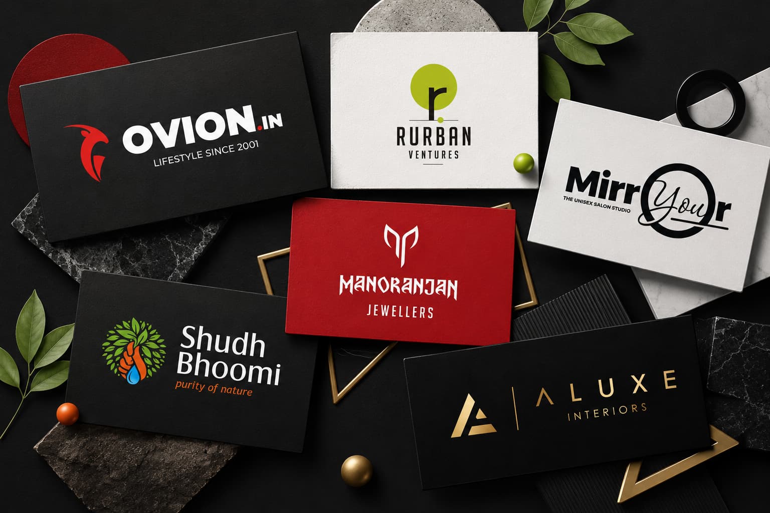
Introduction: Where Psychology Meets Logo Design
Why do some logos become instantly recognizable while others are forgotten within seconds? The answer lies in psychology.
A logo is far more than a visual symbol. It acts as the face of a business, shaping first impressions, influencing emotions, and building trust before a customer interacts with a product or service. Research in consumer psychology shows that people form opinions about brands within milliseconds, and visual elements play a significant role in those decisions.
Every color, shape, font, and design choice sends a subconscious message. A blue logo may communicate trust and reliability. A red logo can create excitement and urgency. Circular shapes often represent unity and community, while angular shapes suggest innovation and strength. Typography further reinforces how consumers perceive a brand’s personality.
This is why successful businesses invest in professional logo design rather than treating a logo as a simple graphic. Strategic logo design combines visual creativity with behavioral science to influence how customers think, feel, and respond to a brand.
In today’s competitive digital environment, where consumers encounter hundreds of brands daily across websites, social media platforms, advertisements, and search engines, a psychologically effective logo can be a major competitive advantage.
Whether you’re launching a startup, building a personal brand, or working with a professional logo design company to rebrand an established business, understanding logo psychology can help create a stronger visual identity that improves recognition, trust, and customer loyalty.
In this guide, we’ll explore how color psychology, shape psychology, typography, neuroscience, and visual perception work together to create memorable logos that influence consumer behavior and support long-term business growth.
Logo Design Statistics Every Business Should Know
Modern branding research consistently demonstrates the impact visual identity has on consumer behavior and purchasing decisions.
| Statistic | Business Impact |
|---|---|
| 94% of first impressions are design-related | Visual branding influences customer trust instantly. |
| Color can improve brand recognition by up to 80% | Strategic color choices increase memorability. |
| Consumers form opinions within milliseconds | Logos influence immediate perception. |
| Consistent branding can significantly improve revenue | Strong visual identity supports business growth. |
| Visual information is processed much faster than text | Logos become powerful communication tools. |
These statistics highlight why businesses increasingly prioritize professional logo design services as part of their overall brand strategy.
Why Do Successful Logos Influence Consumer Behavior?
Successful logos influence consumer behavior because they simplify decision-making.
The human brain constantly searches for shortcuts when evaluating products, services, and brands. Instead of analyzing every detail, consumers often rely on visual cues to make quick judgments.
A professionally designed logo acts as one of those shortcuts.
When customers see a polished logo that aligns with their expectations, they are more likely to perceive the business as trustworthy, credible, and professional. Conversely, a poorly designed logo can create doubt, even when the company’s products or services are excellent.
This is why professional logo design goes beyond aesthetics. The goal is to create a visual identity that communicates the right message to the right audience.
For example:
- A financial institution typically uses colors and typography that reinforce trust and stability.
- A technology startup often chooses modern design elements that communicate innovation and progress.
- A luxury brand usually relies on minimalism and elegant typography to convey exclusivity.
- A food company frequently uses energetic colors that stimulate appetite and attention.
These psychological cues help consumers understand a brand before reading a single word.
Color Psychology in Logo Design

Color is often the first element people notice when they encounter a logo. Before customers read a company name or understand its products and services, they react emotionally to color.
Color psychology studies how different colors influence emotions, perceptions, and behaviors. While cultural differences can affect interpretation, many color associations remain remarkably consistent across industries.
For businesses investing in custom logo design, color selection should be based on audience psychology and brand strategy rather than personal preference.
Red: Power, Urgency, and Excitement
Red is one of the most emotionally intense colors used in branding. It attracts attention quickly and creates feelings of energy, excitement, passion, and urgency.
Because red stimulates action, it is frequently used by brands that want to encourage immediate engagement.
Red commonly communicates:
- Power
- Confidence
- Passion
- Urgency
- Excitement
- Energy
Real-World Logo Examples Using Red
- Coca-Cola uses red to create excitement and emotional engagement.
- Netflix uses red to reinforce entertainment and energy.
- YouTube uses red to capture immediate attention.
- Canon uses red to communicate confidence and leadership.
Red works particularly well for food brands, entertainment companies, retail businesses, and sports organizations.
Blue: Trust, Stability, and Reliability
Blue is one of the most widely used colors in professional logo design because it consistently ranks among the most trusted colors.
Consumers often associate blue with professionalism, dependability, and security.
Blue commonly represents:
- Trust
- Security
- Reliability
- Professionalism
- Intelligence
- Stability
Real-World Logo Examples Using Blue
- IBM uses blue to reinforce authority and expertise.
- PayPal uses blue to communicate transaction security.
- LinkedIn uses blue to support professional credibility.
- Intel uses blue to reinforce innovation and trust.
Blue is especially effective for technology companies, financial institutions, healthcare providers, and professional service businesses.
Businesses seeking a strong and trustworthy visual identity often invest in professional Logo Design Services to ensure their branding aligns with customer expectations and market positioning.
Green: Growth, Health, and Sustainability
Green is strongly associated with nature, health, balance, and growth. It creates a calming effect and is often used by brands that want to communicate environmental responsibility, wellness, or financial prosperity.
Consumers frequently associate green with:
- Nature
- Health
- Growth
- Sustainability
- Prosperity
- Balance
Real-World Logo Examples Using Green
- Starbucks uses green to communicate freshness, community, and growth.
- Whole Foods Market uses green to reinforce natural and organic values.
- Animal Planet uses green to connect with nature and wildlife.
- Spotify uses green to create a modern and energetic identity.
Green is particularly effective for healthcare companies, wellness brands, eco-friendly businesses, agriculture companies, and financial services.
Yellow: Optimism, Happiness, and Energy
Yellow is one of the most attention-grabbing colors in branding. It is associated with positivity, optimism, creativity, and energy.
When used strategically, yellow can make a brand feel approachable and memorable.
Yellow commonly communicates:
- Optimism
- Creativity
- Happiness
- Warmth
- Energy
- Youthfulness
Real-World Logo Examples Using Yellow
- McDonald’s uses yellow to create positive emotional associations.
- IKEA uses yellow to communicate friendliness and accessibility.
- National Geographic uses yellow to create curiosity and exploration.
- Nikon uses yellow to reinforce creativity and innovation.
Yellow works especially well for retail brands, educational companies, children’s products, and food businesses.
Purple: Luxury, Creativity, and Innovation
Purple has long been associated with royalty, prestige, and sophistication. Modern brands often use purple to communicate creativity, imagination, and premium experiences.
Purple is commonly associated with:
- Luxury
- Creativity
- Innovation
- Sophistication
- Wisdom
- Exclusivity
Real-World Logo Examples Using Purple
- Cadbury uses purple to reinforce premium quality.
- Hallmark uses purple to communicate creativity and emotional connection.
- Twitch uses purple to appeal to creative digital audiences.
- Yahoo uses purple to stand out and communicate innovation.
Purple is commonly used by luxury brands, beauty companies, creative agencies, and premium service providers.
Black: Elegance, Authority, and Exclusivity
Black is one of the most powerful colors in logo design. It communicates sophistication, confidence, exclusivity, and authority.
Many luxury brands rely on black because it creates a timeless and premium appearance.
Black commonly represents:
- Authority
- Luxury
- Elegance
- Power
- Prestige
- Sophistication
Real-World Logo Examples Using Black
- Chanel uses black to reinforce luxury and exclusivity.
- Prada uses black to create a premium perception.
- Nike often uses black versions of its logo to communicate strength and confidence.
- The New York Times uses black to reinforce authority and credibility.
Black is ideal for luxury brands, fashion companies, premium services, and professional businesses.
Orange: Fun, Friendliness, and Approachability
Orange combines the excitement of red with the optimism of yellow. It creates an energetic and approachable brand personality.
Orange often communicates:
- Friendliness
- Creativity
- Fun
- Innovation
- Accessibility
- Confidence
Real-World Logo Examples Using Orange
- Fanta uses orange to communicate fun and energy.
- Harley-Davidson uses orange to reinforce adventure and excitement.
- Blogger uses orange to create a friendly and accessible feel.
- SoundCloud uses orange to appeal to creative audiences.
Orange is popular among startups, creative agencies, lifestyle brands, and technology companies.
Why Color Combinations Matter in Logo Design
While individual colors create emotional responses, successful logos often rely on strategic color combinations to strengthen brand messaging.
Color combinations help create balance, improve recognition, and communicate multiple brand attributes simultaneously.
Common Logo Color Combinations and Their Meaning
| Color Combination | Psychological Meaning |
|---|---|
| Blue + White | Trust, Security, Professionalism |
| Red + Yellow | Excitement, Energy, Action |
| Black + Gold | Luxury, Prestige, Exclusivity |
| Green + Blue | Growth, Trust, Stability |
| Purple + Silver | Innovation, Sophistication |
| Orange + Blue | Creativity, Confidence, Friendliness |
Color Psychology Cheat Sheet for Businesses
| Color | Primary Emotion | Best Industries |
|---|---|---|
| Red | Excitement | Food, Entertainment |
| Blue | Trust | Finance, Technology |
| Green | Growth | Healthcare, Sustainability |
| Yellow | Optimism | Retail, Education |
| Purple | Luxury | Beauty, Premium Brands |
| Black | Authority | Luxury, Fashion |
| Orange | Friendliness | Lifestyle, Startups |
What Makes a Logo Memorable?
Some logos become instantly recognizable around the world, while others disappear from memory shortly after being seen. The difference often comes down to psychological effectiveness.
The most memorable logos typically share five important characteristics:
- Simplicity
- Distinctiveness
- Relevance
- Scalability
- Consistency
A memorable logo communicates a clear message without overwhelming the viewer. It remains recognizable whether displayed on a business card, website, billboard, mobile application, or social media profile.
Brands such as Apple, Nike, McDonald’s, Mercedes-Benz, and Adidas have achieved global recognition because their logos are simple, distinctive, and emotionally meaningful.
Businesses investing in professional logo design services should prioritize long-term memorability rather than short-term design trends.
Shape and Symbol Psychology in Logo Design
While color often creates the first emotional response, shapes influence how consumers interpret a brand’s personality.
The human brain naturally assigns meaning to visual forms. Different shapes trigger different psychological associations, making shape selection an important part of logo design.
A professional logo design company carefully considers shape psychology when creating a visual identity because these elements influence trust, memorability, and brand perception.
Circles: Unity, Community, and Wholeness
Circular shapes communicate harmony, connection, inclusion, and protection.
Because circles have no beginning or end, they often symbolize continuity and community.
Brands Using Circular Design Elements
- Mastercard
- Pepsi
- BMW
- LG
Circular logos often feel approachable, friendly, and people-focused.
Squares and Rectangles: Stability, Security, and Trust
Squares and rectangles are among the most commonly used geometric shapes in corporate branding. Their structured appearance creates feelings of order, reliability, and professionalism.
Psychologically, square shapes communicate:
- Trust
- Security
- Stability
- Dependability
- Professionalism
- Structure
Examples of Brands Using Square-Based Logos
- Microsoft
- BBC
- American Express
- National Geographic
Businesses in finance, consulting, technology, and professional services often use square-based design elements because they reinforce credibility and trustworthiness.
Triangles: Direction, Power, and Innovation
Triangles create movement and energy. Unlike circles and squares, triangles naturally direct the viewer’s attention, making them powerful visual tools in logo design.
Triangles often symbolize:
- Growth
- Innovation
- Leadership
- Power
- Direction
- Achievement
Examples of Triangle-Based Logos
- Adidas
- Mitsubishi
- Google Drive
- Delta Airlines
Technology companies and growth-focused brands frequently use triangular elements to communicate progress and forward thinking.
Curves: Creativity, Flexibility, and Human Connection
Curved shapes create a softer emotional response compared to geometric structures. They feel approachable, friendly, and creative.
Curves often communicate:
- Creativity
- Flexibility
- Innovation
- Comfort
- Friendliness
- Adaptability
Brands that prioritize human connection and creativity often incorporate curved elements into their visual identity.
Symbol Psychology in Logo Design
Symbols communicate ideas instantly. When used effectively, they help consumers understand a brand’s purpose before reading any text.
| Symbol | Psychological Meaning |
|---|---|
| Arrow | Progress and movement |
| Shield | Protection and trust |
| Crown | Authority and leadership |
| Tree | Growth and sustainability |
| Mountain | Achievement and strength |
| Star | Excellence and success |
Famous Logo Psychology Case Studies
Apple Logo Psychology
The Apple logo is one of the most recognized visual identities in the world. Its simplicity is the primary reason for its effectiveness.
The clean silhouette communicates innovation, elegance, and premium quality. The logo avoids unnecessary complexity, making it instantly recognizable across digital and physical environments.
The Apple logo demonstrates how minimalism can create powerful brand recognition.
Nike Logo Psychology
The Nike Swoosh is a masterclass in movement psychology.
Its curved form creates a sense of speed, motion, and achievement. Even without the company name, consumers instantly associate the symbol with athletic performance and motivation.
The logo perfectly aligns with Nike’s brand message of pushing limits and achieving goals.
McDonald’s Logo Psychology
The Golden Arches combine two psychologically powerful colors: red and yellow.
Yellow creates optimism and happiness, while red stimulates urgency and excitement.
Together, these elements create strong emotional recognition and encourage fast decision-making.
Typography Psychology in Logo Design
Typography influences how consumers perceive a brand’s personality. Different font styles create different emotional responses.
Serif Fonts: Tradition and Authority
Serif fonts feature small decorative strokes at the ends of letters. These fonts often communicate:
- Trust
- Authority
- Professionalism
- Heritage
- Credibility
Examples of Serif-Based Brands
- Rolex
- Tiffany & Co.
- The New York Times
- Harvard University
Serif fonts are particularly effective for luxury brands, law firms, educational institutions, and professional services.
Sans-Serif Fonts: Modern and Clean
Sans-serif fonts have become increasingly popular because they communicate simplicity, innovation, and clarity.
They are commonly associated with:
- Modernity
- Innovation
- Efficiency
- Simplicity
- Technology
Examples of Sans-Serif Logos
- Microsoft
- Netflix
- Airbnb
Technology companies frequently use sans-serif fonts because they feel clean and contemporary.
Script Fonts: Elegance and Creativity
Script fonts create a more personal and artistic feel. They often communicate sophistication and individuality.
Examples of Script-Based Logos
- Coca-Cola
- Cadbury
- Disney
Script typography works particularly well for luxury products, creative brands, and businesses seeking emotional connections.
Custom Typography: Building Uniqueness
Many successful brands invest in custom typography because it creates distinctiveness and improves recognition.
Custom letterforms help businesses stand apart from competitors while reinforcing their unique brand identity.
Visual Hierarchy and Human Perception
Visual hierarchy determines how consumers process information within a logo.
Size Creates Importance
Larger elements naturally attract attention first. Strategic sizing helps emphasize the most important aspects of a logo.
Balance Builds Trust
Balanced logos appear professional and stable, while unbalanced designs may create subconscious discomfort.
White Space Improves Recognition
White space helps consumers focus on important elements and improves overall memorability.
Golden Ratio Applications
Many iconic logos use proportional design systems to achieve visual harmony and balance.
Consumer Neuroscience and Logo Recognition
The human brain processes visual information thousands of times faster than text. Logos therefore act as cognitive shortcuts that help consumers evaluate brands quickly.
When consumers repeatedly see a logo, neural pathways strengthen. Over time, the logo becomes associated with trust, experiences, and expectations.
This process helps explain why strong logos contribute to customer loyalty and long-term brand recognition.
Industry-Specific Logo Psychology
| Industry | Common Colors | Psychological Goal |
|---|---|---|
| Technology | Blue | Trust and Innovation |
| Healthcare | Blue, Green | Safety and Reliability |
| Luxury | Black | Exclusivity and Prestige |
| Food & Beverage | Red, Yellow | Appetite and Excitement |
A professional logo design company understands how industry expectations influence customer perception and incorporates these insights into the design process.
Related Branding Services
Practical Application: Creating Psychologically Effective Logos
Understanding logo psychology is valuable, but the real advantage comes from applying these principles strategically. The most successful logos are not created by chance. They result from a structured process that combines market research, consumer psychology, branding strategy, and creative design.
Whether you are launching a startup, rebranding an existing company, or hiring a professional logo design company, the goal remains the same: create a visual identity that resonates with your audience and supports long-term business growth.
Step 1: Understand Your Target Audience
Every successful logo begins with audience research. Different customer groups respond differently to colors, typography, and visual styles.
For example:
- Technology buyers often prefer clean and modern designs.
- Luxury customers respond to elegance and exclusivity.
- Healthcare audiences prioritize trust and safety.
- Children’s brands require energetic and playful visuals.
Step 2: Define Your Brand Personality
Ask yourself how you want customers to describe your business:
- Professional
- Innovative
- Creative
- Premium
- Friendly
- Reliable
The answers should influence every logo design decision.
Step 3: Select Strategic Colors
Color selection should align with customer expectations and industry standards while maintaining uniqueness.
For example, a financial services company may benefit from blue tones that communicate trust, while an eco-friendly brand may leverage green to reinforce sustainability.
Step 4: Choose Appropriate Shapes
Shape psychology helps reinforce brand positioning. Circular forms create connection, geometric shapes create stability, and dynamic shapes create movement.
Step 5: Select Effective Typography
Typography should strengthen your brand personality while remaining highly readable across all platforms.
Step 6: Test Scalability
An effective logo should remain recognizable whether displayed on a website favicon, social media profile, mobile application, business card, billboard, packaging, or signage.
Step 7: Maintain Consistency
Consistent logo usage strengthens recognition and trust over time.
Psychological Logo Design Framework
| Design Element | Psychological Purpose |
|---|---|
| Color | Create emotional connection |
| Shape | Communicate brand personality |
| Typography | Build trust and credibility |
| White Space | Improve clarity and recognition |
| Symbols | Increase memorability |
| Consistency | Strengthen brand recall |
Can Logo Design Increase Sales?
Yes, logo design can indirectly influence sales and business growth.
While a logo alone cannot guarantee revenue, it significantly impacts customer perception. Consumers are more likely to engage with brands that appear professional, trustworthy, and credible.
An effective logo contributes to:
- Higher brand recognition
- Greater customer trust
- Improved credibility
- Stronger emotional connection
- Better customer retention
- Competitive differentiation
This is why businesses increasingly invest in professional logo design services as part of their broader branding strategy.
Common Psychology Mistakes in Logo Design
Many businesses unintentionally weaken their branding by ignoring psychological principles.
| Mistake | Impact |
|---|---|
| Choosing colors based on personal preference | Creates audience disconnect |
| Overly complex designs | Reduces memorability |
| Unreadable typography | Hurts recognition |
| Following trends blindly | Creates short-term relevance only |
| Poor scalability | Weakens logo performance across platforms |
| Ignoring audience psychology | Reduces emotional impact |
The most successful logos balance creativity with strategic thinking.
The Future of Logo Design: AI and Psychology
Artificial Intelligence is transforming the branding industry.
Modern AI systems can analyze customer behavior, identify color preferences, evaluate design trends, and predict emotional responses to visual content.
However, AI is most effective when combined with human creativity and strategic brand thinking.
The future of logo design will combine:
- Consumer psychology
- Behavioral analytics
- AI-powered insights
- Human creativity
- Brand strategy
Businesses that leverage both psychology and technology will be better positioned to create memorable and effective visual identities.
Resources and Studies for Further Learning
Professionals interested in logo psychology and brand identity design can explore the following disciplines:
- Consumer Psychology
- Behavioral Economics
- Neuroscience
- Visual Communication
- Brand Strategy
- User Experience Design
- Cognitive Psychology
- Marketing Science
These fields continue to shape modern logo design services and branding best practices.
Frequently Asked Questions About Logo Design Psychology
What Is the Psychology Behind Successful Logo Design?
The psychology behind successful logo design involves using colors, shapes, typography, symbols, and visual hierarchy to influence consumer perception. These design elements create emotional responses that affect trust, recognition, memorability, and purchasing decisions.
Why Is Psychology Important in Logo Design?
Psychology is important because consumers form opinions about brands within seconds. Strategic logo design helps businesses communicate credibility, professionalism, and brand values more effectively.
How Do Colors Influence Consumer Decisions?
Colors trigger emotional responses that influence perception and behavior. For example, blue often creates trust, red generates excitement, green communicates growth, and black suggests luxury.
Which Logo Color Builds the Most Trust?
Blue is widely considered the most trusted color because it is associated with stability, security, professionalism, and reliability.
How Do Shapes Affect Brand Perception?
Shapes communicate subconscious messages. Circles suggest unity, squares represent stability, triangles symbolize innovation, and curves communicate creativity and flexibility.
What Makes a Logo Memorable?
A memorable logo is simple, distinctive, relevant, scalable, and consistent. It should be easy to recognize and understand across all platforms.
Can Logo Design Improve Brand Recognition?
Yes. Effective logo design strengthens brand recall by creating visual consistency and emotional associations that customers remember over time.
Can Logo Design Increase Sales?
A professionally designed logo can improve trust, strengthen brand perception, and support purchasing decisions, which may contribute to increased sales.
How Often Should a Business Update Its Logo?
Businesses should only redesign their logo when their positioning, audience, services, or market expectations change significantly.
What Is the Difference Between a Logo and Brand Identity?
A logo is a visual symbol used to identify a business. Brand identity includes the logo, colors, typography, imagery, messaging, and overall visual experience.
Why Should Businesses Hire a Professional Logo Design Company?
A professional logo design company combines branding strategy, psychology, creativity, and market research to create a logo that supports long-term business goals.
What Industries Benefit Most From Professional Logo Design?
Every industry benefits from professional logo design, including technology, healthcare, education, finance, manufacturing, retail, hospitality, and professional services.
Why Trust Jootoor Designs for Professional Logo Design?
At Jootoor Designs, we believe a logo should do more than look attractive. It should communicate your brand’s personality, build trust, and create lasting recognition.
Our logo design process combines:
- Consumer Psychology
- Brand Strategy
- Market Research
- Visual Identity Design
- Creative Excellence
- Industry Best Practices
Whether you’re launching a startup, growing an established company, or refreshing your brand identity, our team develops custom logo design solutions tailored to your audience and business goals.
About Jootoor Designs
Jootoor Designs is a leading Logo Design Company in India specializing in professional logo design, brand identity design, graphic design services, and strategic branding solutions.
Our mission is to help businesses create memorable visual identities that strengthen recognition, improve customer trust, and support long-term growth.
Conclusion
Successful logo design is not based on luck or artistic preference. It is rooted in psychology, strategy, and consumer behavior.
Colors influence emotions. Shapes communicate personality. Typography builds credibility. Visual hierarchy improves recognition. Together, these elements create powerful brand experiences that shape how customers perceive and remember a business.
Whether you’re building a startup, launching a new product, or rebranding an established company, understanding logo psychology can help create a stronger and more effective visual identity.
Ready to Create a Logo That Builds Trust and Drives Growth?
Partner with Jootoor Designs to create a custom logo that combines creativity, psychology, and strategy. Our expert team develops professional logo design solutions that help businesses stand out, connect with customers, and achieve long-term success.