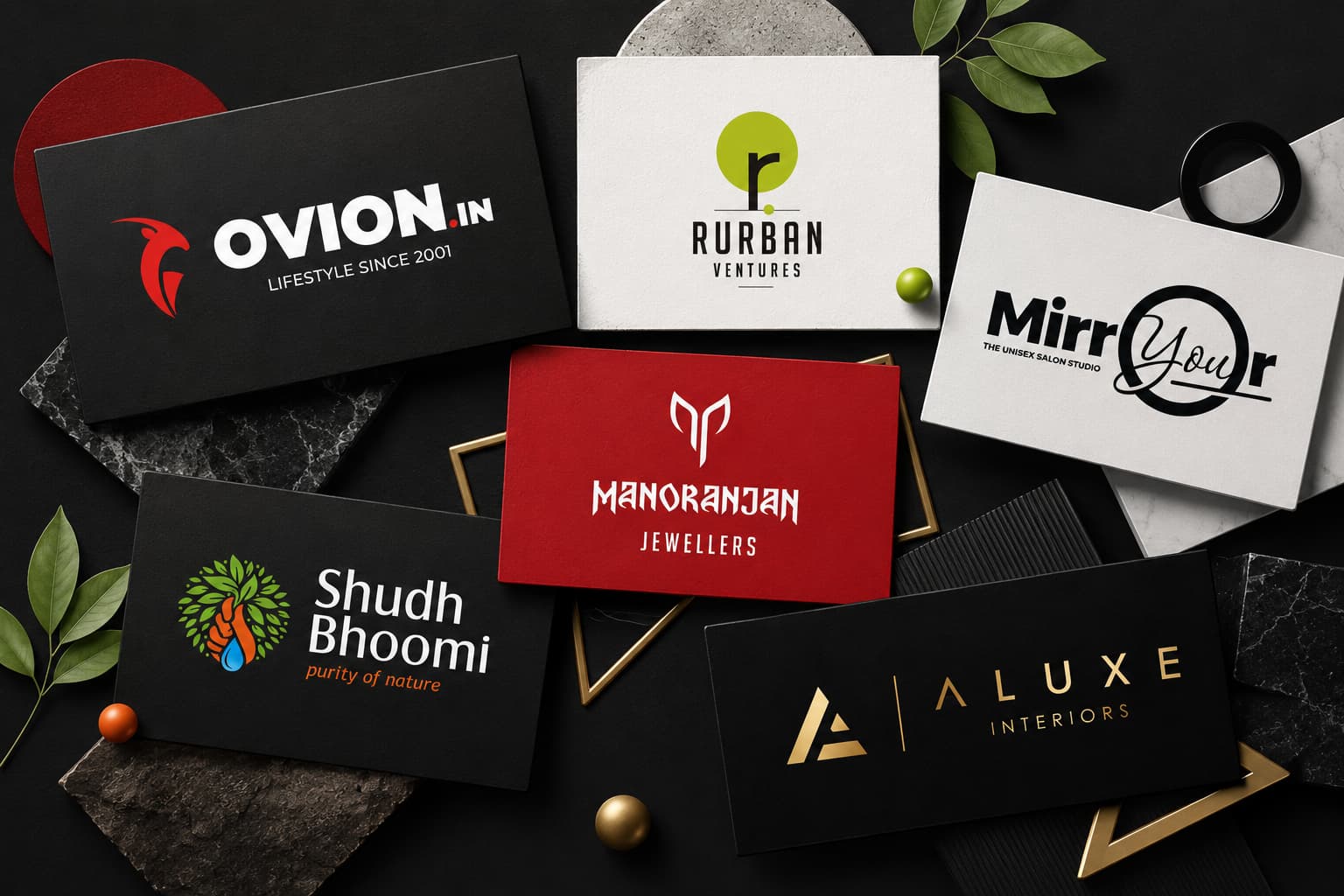
Every shape your logo uses speaks before your customer reads a single word. Here’s what the world’s top brands know — and how you can use it to win in your market.
When you look at the Nike swoosh, the Apple silhouette, or the interlocked rings of Audi — you don’t just see a logo. You feel something. That feeling is no accident. It’s the result of deliberate shape psychology — one of the most powerful and underestimated tools in professional logo design.
As a leading logo design company in Bangalore, Jootoor Designs has crafted brand identities across industries — from tech startups in Koramangala to manufacturing firms in Peenya. One truth holds across every project: the shape of your logo is the first thing the human brain processes, even before colour or text.
Your logo’s shape speaks to your customer’s subconscious in milliseconds — long before they read your name. Choosing the wrong shape is like shaking hands with the wrong hand.
In this guide, we break down every major logo shape — its psychology, emotions it triggers, industries that use it, and real-world brand logos. By the end, you’ll know exactly which shape belongs in your logo — and why.
Circle & Oval Logos
The circle is the most emotionally open shape in logo design. With no sharp edges or corners, it sends an instant signal of warmth, inclusivity, and safety — qualities that the human brain has associated with circles since infancy (think: the sun, the moon, a caring face).
Community, Unity, Friendship, Continuity, Protection, Wholeness, Femininity
Examples of circle logo shapes


Audi’s four overlapping rings represent the merger of four automobile manufacturers — symbolising unity. Mastercard’s overlapping circles communicate two entities working together seamlessly. The Olympics’ five rings are perhaps the most powerful circle logo ever designed, representing the unity of five continents.
Multiple circles together amplify the message: connection, love, support, and infinity. Brands that want to evoke trust, safety, or community are naturally drawn to this shape.
Best industries for circle logos: Beauty & skincare, healthcare, events & hospitality, finance, sports, food & beverage, apps & tech.
Square & Rectangle Logos
Squares and rectangles are the bedrock shapes of corporate identity. Their four equal sides and right angles project balance, dependability, and structural integrity. When a customer sees a square logo, their subconscious receives one clear message: this business is grounded, trustworthy, and here to stay.
Stability, Professionalism, Reliability, Strength, Dependability, Order, Masculinity


Microsoft’s four-square logo is a masterclass in shape storytelling. Each coloured square represents a different product line — together forming a perfect whole: organisation, reliability, and a structured ecosystem.
Pro tip from our Bangalore studio: Modern square logos often soften their rigidity with rounded corners or subtle gradients — balancing trust with approachability. Ideal for tech and SaaS companies who want to appear established yet accessible.
Triangle Logos
The triangle is the most directional of all logo shapes. Unlike circles and squares, a triangle always points somewhere — and that directionality is precisely its power. It signals movement, ambition, and forward thinking.
Energy, Progress, Innovation, Stability (base down), Power, Ingenuity


A triangle pointing upward conveys grounded progression and stability. A triangle pointing sideways communicates speed and forward motion. Adidas’ three-stripe triangle evokes athletic performance — it doesn’t just represent the brand, it moves.
Best for: Technology, sports & fitness, construction, automotive, and any brand positioning itself as dynamic and forward-looking. Triangles are relatively rare — making them stand out powerfully.
Lines, Spirals & Curves
Lines are the most elemental design unit — and their direction tells a complete story. Vertical lines communicate power and authority. Horizontal lines suggest speed and motion. Curves feel human and approachable. Spirals evoke transformation and continuous growth.
Speed (horizontal), Power (vertical), Transformation (spiral), Elegance (curve), Growth


Curves and organic rounded lines appear far more approachable than straight lines. Coca-Cola’s iconic script is built on flowing curves that feel joyful and spontaneous. Curves signal that a brand prioritises the human experience over cold precision.
Organic & Abstract Shapes
Organic shapes are the shapes of nature — leaves, clouds, flowing water, the human body. They don’t follow mathematical rules, and that’s precisely their power. They feel real, authentic, and alive in a way that perfect geometric shapes cannot.
Nature, Authenticity, Warmth, Uniqueness, Handcrafted feel, Creativity


All Logo Shapes at a Glance
| Shape | Core Meaning | Emotions Triggered | Best Industries | Famous Examples |
|---|---|---|---|---|
| Circle / Oval | Unity, continuity, community | Warmth, safety, inclusivity | Beauty, Finance, Healthcare, Sports | Audi, Target, Mastercard |
| Square | Stability, order, strength | Trust, reliability, professionalism | Law, Banking, Consulting, Tech | Microsoft, IKEA, BBC |
| Rectangle | Balance, dependability | Calm, security, groundedness | Corporate, Real estate, Finance | American Express, Uniqlo |
| Triangle (up) | Power, progress, hierarchy | Ambition, energy, strength | Sports, Engineering, Automotive | Adidas, Delta, Mitsubishi |
| Triangle (sideways) | Forward motion, speed | Excitement, momentum | Media, Tech, Gaming | Google Play, Caterpillar |
| Horizontal lines | Speed, calm, stability | Motion, reliability | Tech, Transport, Media | IBM, Cisco |
| Vertical lines | Power, aspiration, boldness | Authority, innovation | Music, Tech, Financial | SoundCloud, Deloitte |
| Spiral | Growth, transformation, depth | Wonder, evolution, curiosity | Wellness, Education, Tech | Whirlpool, Time Warner |
| Organic shapes | Nature, authenticity | Warmth, earth, honesty | Food, Wellness, Eco brands | Starbucks, Whole Foods |
| Abstract shapes | Unique identity, complexity | Intrigue, creativity, innovation | Tech, Creative, Lifestyle | Nike, Slack, Apple |
How to Choose the Right Logo Shape for Your Business
Choosing the right shape isn’t guesswork — it’s strategy. Here’s the framework our Bangalore logo design team uses with every client:
1. Define Your Brand Values
List 3–5 adjectives that describe your business. Trustworthy? Innovative? Playful? Earthy? Each maps naturally to a shape family.
2. Know Your Audience
Young urban professionals respond differently to shapes than family shoppers or B2B procurement officers. Shapes carry cultural meanings too.
3. Study Your Competitors
If all competitors use circles, a strong triangle or square mark could differentiate you powerfully. Stand out deliberately.
4. Consider Industry Norms
Some shapes carry strong industry associations. Breaking them can be genius — or confusing. Decide intentionally, not accidentally.
5. Think Across All Touchpoints
Your logo lives on business cards, apps, signage, and vehicle wraps. Complex shapes may not scale well. Simplicity survives.
6. Don’t Mix Too Many Shapes
Combining shapes creates rich meaning — but more than two primary shapes in a logo risks confusion. Keep it intentional and clean.
The best logos don’t just look good — they feel right to the people they’re designed for. Shape is the reason a logo feels right before you know why.
Frequently Asked Questions
What is the most popular logo shape?
Circle logos are the most common globally — appearing across sports, beauty, finance, healthcare, and technology. Their universal appeal makes them the default for brands wanting to appear approachable and trustworthy. However, your best choice depends on your brand values, not industry defaults.
Can I combine shapes in one logo?
Absolutely — Audi combines four circles, the Olympics five, Adidas forms a triangle from three lines. The key is intentionality: every shape should add meaning, not visual noise. Limit primary shapes to two to keep the logo clean and scalable.
Does logo shape affect business performance?
Research shows 42% of consumers say logos communicate a brand’s personality — and brand personality directly affects purchase decisions. A misaligned shape creates subconscious distrust. Aligned brand identity is associated with 7× more revenue growth than inconsistent branding.
How much does professional logo design cost in Bangalore?
Logo design pricing in Bangalore ranges from ₹2,000 freelancer designs to ₹50,000+ for full brand identity from established studios. At Jootoor Designs, we offer transparent milestone-based pricing covering research, concept development, shape strategy, and multi-format delivery. Contact us for a custom quote.
How long does logo design take?
A professional process — discovery, research, concepts, refinement, and final delivery — typically takes 7–21 working days. At Jootoor Designs, our standard timeline is 10–14 working days for a full logo and basic brand identity package.
Why hire a logo design company in Bangalore rather than use a free tool?
Free tools generate generic, template-based marks shared across thousands of businesses. Jootoor Designs conducts market research, competitor analysis, and brand strategy before a single shape is drawn. Your logo becomes a strategic asset uniquely tailored to your business — not a template anyone can replicate for free.