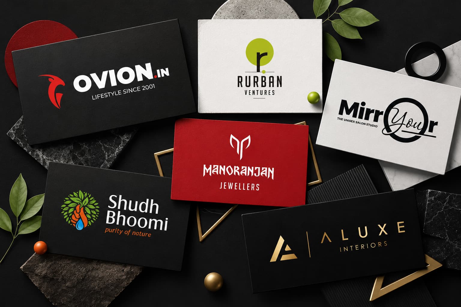
A logo is more than just a graphic—it’s the visual handshake between a brand and its audience. The right logo solidifies brand identity, setting the tone for how customers perceive your company at first glance.
Throughout the history of branding, logos have evolved in style: from intricate emblems of the early 20th century to bold, complex designs dominating mid-century packaging. Today, we see a rise in minimalist logos.
Evolution of Logos: A Quick Overview
- Early logos featured detailed illustrations and elaborate crests.
- With the advent of the digital age, clean and simplified designs became popular for instant recognition.
- Looking ahead to 2025, we can expect sleek minimalist logo designs that go beyond temporary trends.
Why Minimalism Matters
Minimalism isn’t just about having less clutter—it’s a strategic response to busy digital spaces and shorter attention spans. Brands like Apple and Jootoor Designs use minimalist logos to convey clarity and sophistication.
In fact, Jootoor not only excels in creating minimalist logos but also offers resources such as a simplistic logo maker or minimalist logo creator that make these styles accessible to startups and global powerhouses alike.
The Power of Visuals
Moreover, the importance of high-quality visuals cannot be overstated. Every eye-catching mock-up design begins with a great image. To achieve this, one must learn how to find the perfect mock-up images for their next project.
Video Content in Branding
Additionally, in today’s digital landscape where video content reigns supreme, understanding the role of online video editing in content creation and marketing can greatly enhance engagement and conversions.
This comprehensive approach to branding—using minimalism in logos, high-quality mock-up images, and effective video content—is why minimalist logos continue to dominate modern branding.
Minimalist logo design isn’t just a trend—it’s a branding strategy built for the demands of today’s market. Clean, pared-down logos cut through the digital noise with immediate impact. They’re engineered for visibility, standing out whether on a crowded social feed or the corner of an app icon.
The Benefits of Minimalist Logos
- Visibility: Simple shapes and limited details grab attention at any size or distance.
- Memorability: A single, uncluttered visual cue is far easier for customers to recall than a busy emblem.
- Trust: Timeless logos signal confidence and stability, inviting consumers to connect with and rely on the brand.
Brands that lean into minimalist aesthetics project sophistication without saying a word. This approach is not only about aesthetics but also aligns with effective SEO strategies, enhancing online visibility and lead generation.
The Ongoing Relevance of Minimalism
Minimalism’s focus on clarity means nothing distracts from the core message—a key reason why these logos continue to dominate in 2025. As attention spans shrink and competition grows, simplicity becomes the sharpest tool in a brand’s arsenal. Moreover, integrating concepts like the golden ratio in logo design can further enhance its effectiveness by creating visually pleasing proportions.
The Power of Simplicity in Branding
Simple logos act like visual shortcuts for the brain, making brand recognition almost instant. When a logo is stripped down to its essence, it’s easier to remember after just a single glance. Think of it as a signature—unique, unmistakable, and quick to identify.
Iconic minimalist logos set the gold standard:
- Apple: A clean, bitten apple silhouette that works on billboards and watch faces alike. The use of colors that start with A in their branding adds to its simplicity and effectiveness.
- Nike: The swoosh—just a single curve, yet it signals speed and confidence worldwide.
- Google: Its wordmark uses playful colors and unembellished letterforms, creating a friendly yet authoritative presence. This approach is similar to the ongoing debate between Google vs ChatGPT, where simplicity in design and functionality plays a crucial role.
These brands leverage clean geometric shapes and limited color palettes to achieve strong visual impact. No clutter, no fuss—just clarity and confidence. The simplicity behind these designs isn’t accidental; it’s a calculated move that anchors their place in the global market, proving that less truly can be more in branding.
Benefits of Minimalist Logos for Businesses
Minimalist logos deliver standout advantages for brands looking to thrive in a crowded marketplace. Here’s why minimalist logos still rule:
1. Timeless Appeal & Versatility
Simple logo designs age gracefully. Strip away the trends, and what’s left is a mark that looks as fresh today as it will years from now. Whether on digital screens, business cards, or billboards, a versatile logo design keeps its integrity and impact.
2. Cost-Effective Branding
Minimal details mean lower production costs. There’s no need for intricate printing processes or specialty inks. A minimalist logo scales down to a favicon or up to signage, all while staying crisp and clear—no expensive adjustments required.
3. Adaptability Across Media
From social media avatars to product packaging, minimalist logos translate seamlessly across all channels. The uncluttered aesthetic ensures your brand remains instantly recognizable, no matter the platform.
Simple design isn’t just about style—it’s smart business. Brands investing in minimalist marks enjoy flexibility and savings, setting themselves up for long-term success.
In today’s digital age, incorporating strategies like B2B Digital Marketing can further enhance the effectiveness of minimalist logos. These logos are not only adaptable across various media but also blend perfectly with the online platforms where they are often showcased.
Moreover, partnering with a Digital Marketing Company can help businesses optimize their online presence. Such companies offer services like SEO and PPC management which can significantly increase the visibility of a brand’s minimalist logo.
Speaking of SEO, it’s worth noting the top advantages of SEO content writing. Good SEO content can increase traffic, leads, and sales opportunities for businesses of all sizes. This means that when paired with a minimalist logo, SEO-rich content can create a powerful branding strategy.
Lastly, when designing a minimalist logo, understanding color psychology can be beneficial. For instance, exploring different shades of brown color can provide warm and earthy design inspiration that aligns with the brand’s identity.
Minimalist Logos Enhance Brand Recall
Memorable logos don’t just catch the eye—they stick in the mind long after first glance. The secret? Simplicity. A clean design makes it easy for customers to remember and recognize a brand, even as they scroll through busy digital feeds.
1. Simplicity Drives Memory
Simple shapes and uncluttered layouts are processed faster by the brain, leading to stronger memory retention. Think of the Nike swoosh or Apple’s iconic apple—each is stripped to its essence, making them instantly recognizable.
2. Trust Through Clean Design
Consumers associate minimalist aesthetics with transparency and reliability. When a brand presents itself without visual clutter, it signals confidence and authenticity.
3. Whitespace & Negative Space
Strategic use of empty space helps logos breathe, focusing attention on core elements. The importance of whitespace in design cannot be overstated, as it allows for better readability and user experience. Additionally, the clever use of negative space in logos—like the arrow in FedEx or the hidden bear in Toblerone—adds layers of meaning while keeping designs crisp and memorable.
A memorable logo built on these minimalist foundations reinforces brand recall every time a customer encounters it. However, it’s not just about the logo. To further enhance brand recall and foster loyalty, incorporating video into your marketing strategy can be incredibly effective. Video content has proven to be a powerful tool in building brand awareness and establishing a deeper connection with consumers.
Minimalism in the Digital Age
Minimalist logo design sits at the heart of digital branding. A simple, bold mark scales down beautifully for app icons and mobile screens, where space is at a premium. Think about the way Airbnb’s “Bélo” symbol or Twitter’s iconic bird instantly stand out as tiny squares on your phone—no unnecessary detail, just pure brand essence.
The Importance of Minimalism in Digital Branding
In today’s digital age, minimalism has become an essential aspect of branding, especially when it comes to logo design. Here are some reasons why minimalist logos are crucial for digital branding:
- Mobile-friendly logos thrive in fast-scrolling environments. With shrinking attention spans, users grasp clean shapes and limited colors faster than busy illustrations.
- Responsive logo design is now essential. A minimalist logo adapts seamlessly to any device: from a smartwatch face to a billboard. No loss of meaning or clarity, even in the smallest formats.
- Digital-first brands prioritize flexibility. With just a few pixels, a well-crafted minimalist logo remains recognizable, making it ideal for everything from social media avatars to website favicons.
The Power of Strong Minimalist Branding
A strong minimalist mark works like a digital passport—versatile, unmistakable, and always ready for the next platform shift. To achieve such impactful branding, partnering with a proficient digital agency can be invaluable. Choosing the right digital agency can significantly enhance your business’s online presence and branding strategy.
Moreover, understanding the evolution of minimalism in logo design can provide deeper insights into creating effective minimalist logos that resonate with audiences and stand the test of time.
Modern Minimalist Logo Design Trends in 2025
Modern minimalist logos are setting the tone for 2025, blending clarity with fresh creative energy. Brands are leaning into flat design trends—think crisp edges, balanced spacing, and subtle gradients that add depth without clutter. These touches keep logos feeling sharp and dynamic across digital platforms.
Typography-focused logos
Clean sans serif fonts deliver messages with confidence while staying approachable. This typographic clarity helps a minimal logo maker craft visuals that feel both modern and timeless. For those interested in diving deeper into this subject, this beginner’s guide to typography offers valuable insights.
Single-color palettes
Iconic brands like Airbnb and Spotify show how a strong hue anchors a logo’s presence everywhere it appears. Designers often explore various shades of black to find the perfect fit for their minimalist designs.
Animated minimal logos
Simple geometric shapes spring to life through motion, capturing attention in scrolling feeds and app icons.
Designers see these trends as tools for crafting a creative minimal logo that stands out—proof of why minimalist logos still rule in a world where versatility meets sophistication.
To further enhance visual impact, exploring inspiring logo color combinations can ignite design creativity. Additionally, understanding the hidden meanings behind clever logos can provide unique insights into effective branding strategies.
How to Design a Minimalist Logo That Works
A minimalist logo isn’t just about stripping things back—it’s about intentional design choices that let your brand’s personality shine. Begin by identifying one core concept that captures your brand essence; this singular focus guides every creative decision, from shape to color. Think of Airbnb’s “Bélo” symbol: a simple icon representing belonging, instantly tying back to their mission.
1. Choose the Right Typography
Clean, highly readable typefaces—often sans serif—keep the message clear and modern. For this, you might want to explore some modern fonts that align with your brand’s identity. Test your logo at various sizes; if the letterforms remain strong and legible, you’re on the right track.
2. Keep it Clutter-Free
Challenge yourself to remove any element that doesn’t serve a purpose. Whitespace becomes your secret weapon, providing balance and boosting visual impact.
3. Start with Efficient Tools
For an efficient start, try tools like a minimalist logo maker or simplistic logo creator. Explore different minimalist logo ideas but always filter them through the lens of clarity and relevance to your brand story.
4. Understand Visual Hierarchy
Incorporating principles of visual hierarchy can significantly enhance your logo design. This involves arranging elements in a way that clearly indicates their order of importance, guiding the viewer’s eye through the design seamlessly.
Conclusion
Choosing simplicity isn’t just about following a trend—it’s about creating a foundation for brand longevity. Minimalist logo dominance continues because it delivers timeless logo design that resonates in any era, on any device. With every curve and whitespace, brands communicate confidence, clarity, and trust. When you invest in minimalist logos, like those crafted by Jootoor Designs, you’re not just designing for today; you’re crafting a visual handshake that remains unforgettable tomorrow.
Why Minimalist Logos Still Rule: Brands like Jootoor Designs prove that stripping back the unnecessary leads to enduring success—minimalism is the secret ingredient for logos that stand the test of time. Their portfolio showcases successful projects such as Vroom Drive and M14th, which exemplify this approach.
Moreover, adopting minimalist strategies isn’t limited to design alone. The principles of minimalism can also be applied to various aspects of business for achieving success. For instance, the insights shared in the article on the Top 7 Strategies to Implement before 2020 for Success could provide valuable guidance.
In addition, as we move further into the digital age, it’s essential to leverage technology. The integration of AI & ML into various sectors, including banking, is a prime example of how technology can enhance efficiency and service quality. The article on AI & ML: The Next Big Thing in Banking? explores this transformative trend in detail.
FAQs (Frequently Asked Questions)
Why do minimalist logos continue to dominate branding trends in 2025?
Minimalist logos remain the preferred choice in 2025 due to their strategic advantages in modern branding. They offer clarity, sophistication, and timeless appeal, ensuring high visibility, memorability, and fostering consumer trust across diverse platforms.
How does simplicity in logo design enhance brand recognition?
Simplicity aids brand recognition by making logos easy to recall and identify. Iconic minimalist logos like Apple, Nike, and Google utilize clean geometric shapes and limited color palettes, creating strong visual impact that resonates globally.
What are the key benefits of adopting a minimalist logo for businesses?
Minimalist logos provide timelessness and versatility across digital and print media, reduce branding costs through ease of reproduction, and maintain adaptability without losing impact. This makes them cost-effective and efficient for businesses aiming for consistent brand identity.
In what ways do minimalist logos improve brand recall among consumers?
Minimalist logos enhance brand recall by leveraging simplicity which boosts memory retention. The use of whitespace and negative space reinforces the clean design aesthetic, fostering stronger emotional connections and increased consumer trust.
Why is minimalism particularly effective in digital branding and mobile-friendly designs?
Minimalist logos are highly suitable for digital branding due to their clarity on small screens like app icons. They accommodate shorter online attention spans and support responsive designs that adapt seamlessly across various devices, enhancing user engagement.
What are the latest trends in modern minimalist logo design for 2025?
Current trends include flat designs with subtle gradients, typography-focused logos featuring clean sans serif fonts, single-color palettes, and animated minimal logos. These elements combine creativity with simplicity to engage audiences effectively while maintaining brand essence.