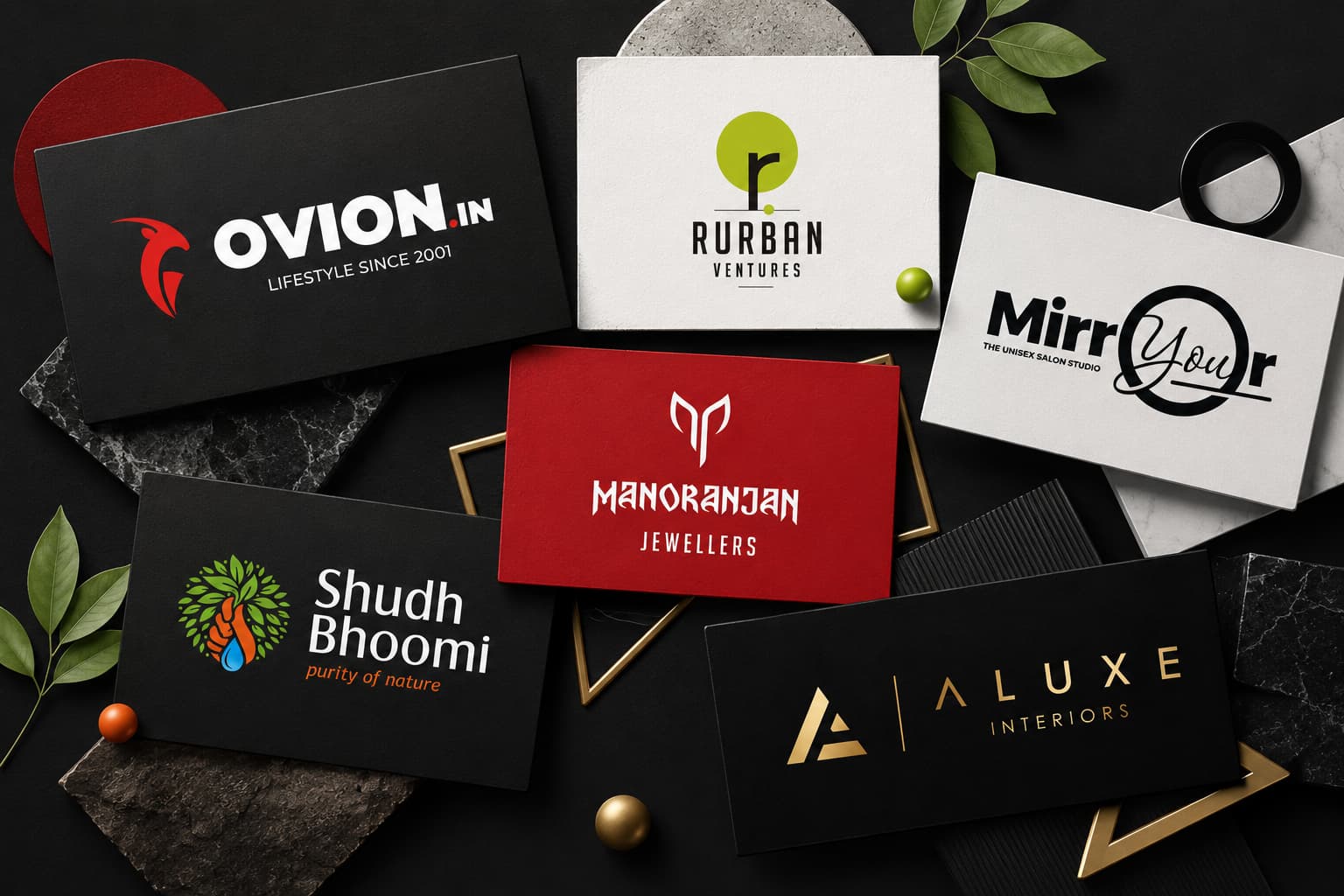
A brand’s logo should memorably capture the essence of the brand in pictorial form.
Logos with a simple idea and clean lines tend to have a more modern appeal.
Less is quite often more, but this leans towards favoring the minimalist approach to logo design, which has left some wondering where the line is.
Can a logo be too simple?
You have a single visual element that needs to create a lasting impression. Does minimalism risk monotony?
Today, we’ll dive into the appeal, benefits, and limitations to try and answer exactly that.
Minimalist Design Allure
The data shows that consumers prefer a simple logo design with 64% in favor. Keeping things minimalist prioritizes clarity and keeps the design focused.
Going minimalist sets limitations on the details, and that requires deeper thought in terms of transmitting the core message without anything unnecessary.
Those limitations, however, can also sometimes be a double-edged sword, so a balance must be struck to reap the benefits without oversimplifying the logo design to the detriment of the brand.
Minimalist Logo Benefits
A minimalist logo can be very powerful. A simple design is eye-catching and easy to recall, making it versatile for business cards, social media, and correspondence.
Minimalist designs have something timeless yet modern about them, many of the world’s oldest leading brands have minimalist logos that are iconic and universal such as Nike.
Over-Simplification Risk
Of course, without thought and caution, the flip side is that a logo that is overly simplified could lose meaning.
Modern consumers enjoy a deeper connection to brands now in a world where most reach out and engage with their demographics.
Stripping something back too much runs the risk of watering down the identity; your logo should still evoke some sort of response.
The Best of Both Worlds
Ultimately, an equilibrium needs to be struck during the design phases to make sure your logo is clean and clear but tells a story and gives your brand an avatar so to speak.
Don’t be Afraid of Subtle Detail
Although you might be opting for a minimalist approach, don’t forget that subtle details can make all the difference when it comes to giving a simple logo design so much needed character.
Think outside of the box in terms of negative space and typography. Make sure to tweak the form, make it your own, and elevate the design without overshadowing its simplicity.
Aligning with A Brand’s Message or Purpose
A logo shouldn’t be designed simply because you like that color or think cursive is pretty. It should tell the story, or be the face, the identity of the brand. Think about your brand message mission, ethos, and your demographic.
A company manufacturing for kids is going to have a more playful logo than an educational resources company or a medical journal.
You may consider what you want to be conveyed and communicated at the end of the day.
A good example is the Airbnb logo which resembles a capital A but cleverly has the form of a map marker concealed within it highlighting what the company does.
To think outside of the box, ask yourself what you do, and brainstorm.
Let’s say you’re looking for some inspiration for your new project. Why not check what your international colleagues are doing? A Mozilla VPN download could allow you to bypass geo-restrictions and take a peek at the designs otherwise unavailable in your location.
Minimizing Detrimental Minimalism Limitations
Minimalism isn’t the way to go for everyone sometimes, an industry calls for something a little bit more elaborate. So, knowing when to reel in the creativity and when to unleash is key.
Complex Logo Success
There are countless examples of intricate and complex logos that work well for successful brands.
Harley Davidson, for example, is a long-running heritage brand, and that heritage is reflected in its more complex logo designs that have changed over the years. The same can be said for modern brands such as Starbucks.
So it is important to remember it that there is no one-fits-all approach for a logo. But generally speaking, complexity should be avoided unless the detail is meaningful and intentional.
Knowing When Less is More
Essentially, you don’t want to bombard an audience with anything unnecessary, if clarity is important to your industry then minimalism will likely serve you best.
Startups, especially digital startups, need accessibility, and often, keeping it simple is the best way to go.
Keeping Context at the Forefront of Logo Design
To evaluate whether or not your minimalist design is boring or whether the logo is too complex you need to keep context in mind at all times and weigh it up whilst considering the medium, the audience, and brand strategy.
Cross-Platform Adaptation
Remember you want your logo to be versatile enough for use on any kind of platform or media, whether it is a huge billboard or a tiny business card.
Once again, simple designs usually offer the best versatility, but that doesn’t mean complexity has no place.
Making Sure It’s Memorable
Regardless of how simple or complex you decide to go, the aim of the game is to have the logo stick in people’s minds. Statistically, a consumer needs around eight impressions to memorize a logo design, but the more memorable it is to begin with, the lower that figure.
Consider your aesthetics, your brand message, your audience, and your function to create a logo design that leaves an impression.
Conclusion
The minimalist approach is a powerful and effective marketing tool, but only if it conveys the message it is supposed to.
If it is too simple, then it does nothing to give a brand any form of identity. It can indeed be so boring that it doesn’t leave an impression that makes it memorable enough to recall.
Simplicity must be blended with meaning and personality to create a logo that keeps context and messaging at the forefront of its design.
With today’s discussion, hopefully, you can strike the balance and walk the line between minimal and meaningful.