

The Story Behind the Iconic Instagram Logo
The Instagram logo is a symbol of social media branding, representing not just an app, but a cultural movement. It has become a symbol of digital creativity and visual storytelling. The evolution of its design reflects Instagram’s growth from a basic platform for sharing images to an interactive social network.
Why the Evolution of the Instagram Logo Matters
Understanding how the Instagram logo has changed over time reveals its significant influence on the platform’s identity. This knowledge can benefit businesses and designers who want to create logos that connect with users on a deeper level.
Here are some key lessons we can learn:
- The importance of being flexible in branding.
- How a well-planned redesign can strengthen brand presence.
- The role of simplicity in improving recognition and recall.
What We Can Learn from Instagram’s Branding Evolution
Instagram’s journey offers valuable insights for achieving long-lasting brand success in today’s fast-paced digital world. By studying its evolution, we can gain a better understanding of essential elements such as typography, layout, composition, and images—all crucial aspects in creating an impactful logo.
Additionally, exploring different types of backlinks and their impact on SEO can provide valuable knowledge for brands seeking to improve their online visibility.
A Brief History of Instagram’s Logo

The history of the Instagram logo begins with its launch in 2010. The original design was a bold representation of the platform’s initial focus on photo-sharing, featuring a retro-inspired camera icon that drew inspiration from classic Polaroid cameras. This design choice encapsulated the nostalgia and simplicity associated with instant photography, making it easily recognizable and relatable for users.
Key Features of the First Instagram Logo:
- Polaroid Camera Design: A nostalgic nod to vintage photography, appealing to users’ love for retro aesthetics.
- Detailed Elements: Included intricate features like a lens, viewfinder, and colorful rainbow stripe, adding depth and character to the logo.
The evolution of the Instagram logo over the years showcases its adaptability and growth alongside technological advancements. In 2011, Instagram introduced a significant update that preserved its vintage charm while incorporating modern elements:
- 3D Feature Addition: Enhanced visual appeal by introducing three-dimensional effects.
- Vintage Style Retention: Maintained the beloved classic look while subtly updating its aesthetic to keep up with contemporary design trends.
A pivotal moment in the Instagram logo redesign case study occurred in 2016. This major overhaul marked a departure from detailed imagery towards a more streamlined and versatile symbol:
- Simplified Modern Icon: Replaced the elaborate camera illustration with a minimalist outline, emphasizing clarity and scalability across various digital interfaces.
- Vibrant Color Palette: Introduced a dynamic gradient of pink, purple, and orange to evoke emotions like energy, creativity, fun, and imagination. This choice injected warmth and vibrancy into the brand’s visual identity.
Interestingly, this shift towards minimalism mirrors a broader trend in graphic design where brands are opting for simpler logos that are easier to recognize and remember. This is where understanding how to get the perfect mock-up image becomes crucial for designers. Each head-turning mock-up design starts with a good image. For those looking for guidance on finding the perfect mock-up images for their next project, resources like Jootoor offer valuable insights.
This timeline of Instagram logo updates reflects not only changes in artistic direction but also strategic decisions aligned with evolving market trends and user expectations. Each iteration underscores how design adaptations can mirror shifts in brand identity while maintaining core values that resonate with audiences worldwide.
Furthermore, as we analyze these changes, it’s interesting to note how color plays a pivotal role in branding. The introduction of vibrant colors in Instagram’s logo is a testament to this fact. For instance, exploring different shades of brown could provide warm and earthy design inspiration across various styles and settings. Understanding shades of brown color along with their hex, RGB, CMYK codes could be beneficial for designers aiming to create visually appealing content that aligns with current trends.
🔗 Get Started Today | 📞 Contact Us | 💡 Explore Our Portfolio
Analyzing Instagram’s Logo Evolution Over Time
Instagram’s logo evolution offers a fascinating glimpse into how visual design can reflect the shifting identity of a brand. Instagram’s logo transformation journey is marked by significant changes, each iteration capturing new aspects of its evolving brand ethos.
Timeline of Instagram Logo Updates
2010-2011: The first logo redesign

A retro-style Polaroid camera, setting the tone for a platform centered around imagery and nostalgia.
The 2011 Update

Added depth with a 3D effect while retaining the classic vintage appeal, catering to an audience that appreciated Instagram’s unique blend of old-world charm with modern digital functionality.
2016: Modern Icon

A bold departure into minimalism, introducing a flat, abstract camera icon awash in vibrant hues of pink, purple, and orange. This redesign marked a significant turning point in aligning Instagram’s image with contemporary design trends.
Comparing Old and New Instagram Logos
- Original vs. Modern Design: The original logo was intricate, detailed, and nostalgic; the modern version is minimalistic, vibrant, and clean.
- While the first logo appealed to nostalgic sensibilities, the current design speaks to modern aesthetics, simplicity being key to its universal recognizability.
User Reception and Market Trends
User reception has played a crucial role in shaping these transformations. The initial reaction to the 2016 change was mixed:
- Negative Sentiments: Many users expressed discomfort with the drastic shift away from a beloved design.
- Positive Reception: Over time, users began to appreciate the new logo as an emblem of Instagram’s forward-thinking approach and commitment to innovation.
Market trends also influenced these choices:
- Early logos were designed during an era where skeuomorphism was popular, thus reflecting real-world textures and depth.
- Recent designs embrace flat design principles prevalent in digital interfaces today, ensuring compatibility across various screen sizes and devices.
The evolution from a detailed Polaroid replica to an abstract icon encapsulates how Instagram has grown from a simple photo-sharing app into a comprehensive social networking platform. This transformation reflects not only changes in user expectations but also broader shifts within graphic design paradigms over time.
Understanding this evolution provides valuable insights into effective branding strategies — highlighting the importance of balancing innovation with user familiarity. As Instagram continues to adapt its visual identity in tandem with emerging trends, it sets a benchmark for other brands navigating their own paths through dynamic digital landscapes.
Design Elements Behind the Current Instagram Logo
The current Instagram logo is a representation of the platform’s modern identity, showcasing its evolution and dedication to innovation. At its core, the logo features a simple camera icon design. This simplified representation is not just about minimalism; it reflects Instagram’s roots as an image-sharing application while embracing contemporary aesthetics.
1. Camera Icon Design
The fundamental shape of the camera icon is abstract, yet easily recognizable. This abstraction allows for versatility across various screen sizes and digital platforms, ensuring that the logo remains clear and impactful in different contexts. The flat design choice aligns with modern digital design principles, which emphasize simplicity and clarity.
2. Vibrant Color Palette
The Instagram logo is known for its vibrant gradient color scheme, incorporating shades of pink, purple, and orange. These colors have specific meanings:
- Pink often symbolizes energy and passion.
- Purple evokes creativity and imagination.
- Orange represents fun and enthusiasm.
The combination of these colors creates a dynamic gradient that captures attention while conveying a sense of warmth and openness. This vibrant palette appeals to a wide audience by resonating with emotions associated with social interaction and creative expression.
3. Gradient Effect
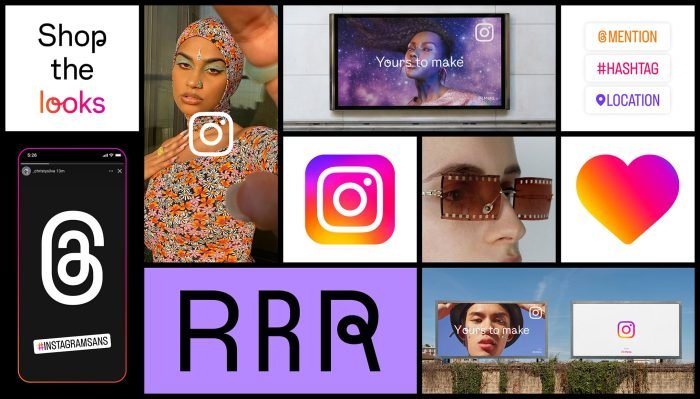
The gradient adds depth to the otherwise flat design, providing a contemporary feel that mirrors Instagram’s innovative spirit. This effect is achieved through smooth transitions between colors, reflecting the fluidity of user experiences on the platform.
Understanding these elements provides insight into why this logo remains effective in representing Instagram’s brand identity. It balances simplicity with vibrancy, ensuring it is both memorable and adaptable—a crucial combination for any brand looking to make a lasting impression in today’s digital landscape.
This design is not just about appearance; it’s an embodiment of Instagram’s ongoing narrative—a story of transformation from a simple photo-sharing app to a comprehensive social media platform that encourages creativity, connection, and community engagement.
The vibrant color palette used in the logo can be linked to inspiring logo color combinations which are essential for creating stunning visual impact. Each color chosen serves a purpose, reflecting deeper meanings as explored in articles about the hidden meaning of clever logos. Furthermore, understanding the psychology behind colors can be beneficial; for instance, exploring colors that start with A or colors that start with F, could provide additional insights into effective color usage in branding.
Lessons from Instagram’s Logo Evolution for Social Media Branding Success
Lessons from Instagram’s Logo Evolution for Social Media Branding reveal essential strategies that can guide businesses aiming to build a strong brand presence. Instagram’s journey of logo transformation offers valuable insights into creating logos that resonate deeply with audiences.
Key Insights from Instagram’s Logo Evolution
- Simplicity is Paramount: Analyzing Instagram’s logo evolution underscores the importance of simplicity in design. Simplified logos are more memorable and versatile, making them suitable for various applications across different platforms. A streamlined design aids in quick recognition and retention, crucial in today’s fast-paced digital world.
- Adaptability Across Platforms: Instagram exemplifies how a logo should seamlessly adapt to multiple screen sizes and devices without losing its essence. Ensuring that your logo maintains its integrity across different digital environments enhances brand consistency and user experience.
- Reflective of Brand Identity: Each iteration of Instagram’s logo mirrored shifts in the platform’s identity—from a photo-sharing app to a comprehensive social networking service. This alignment between visual identity and brand evolution is critical for businesses to foster an authentic connection with their audience.
- Embracing Modern Aesthetics: The shift towards a modern, vibrant design in 2016 marked a significant pivot for Instagram, aligning its visual identity with contemporary aesthetics. Businesses can learn the value of staying attuned to current design trends while also retaining elements unique to their brand.
- Highlighting Core Values through Design: The current logo’s vibrant color palette reflects energy, fun, and creativity—values central to Instagram’s mission. By embedding core values into visual elements, logos can communicate more than mere aesthetics; they convey the brand’s ethos.
Strategies for Effective Logo Design
- Prioritize Versatility: Ensure your logo functions well across various platforms, whether it be a mobile app icon or a business card.
- Simplify for Impact: Focus on straightforward designs that capture attention and are easy to remember.
- Stay True to Your Brand: Align your logo with the evolving nature of your brand while maintaining core elements that users associate with you.
- Incorporate Contemporary Trends: Balance timelessness with modern trends to keep your brand relevant.
- Communicate Through Colors: Use colors strategically to evoke emotions and highlight what your brand stands for.
Conclusion
Embracing change through effective logo redesigns is crucial for staying relevant in an ever-evolving online landscape. The Instagram logo serves as a testament to the power of adaptability, demonstrating how thoughtful updates can maintain brand identity while appealing to modern aesthetics. By evolving from a retro camera design to a vibrant, simplified icon, Instagram has managed to symbolize its transformation from a simple image-sharing app to a comprehensive social network.
These lessons emphasize the significance of ongoing evolution in branding strategies, showcasing how successful logo redesigns play a vital role in creating enduring connections with audiences in the digital era.
FAQs (Frequently Asked Questions)
The Instagram logo plays a crucial role in social media branding as it encapsulates the platform’s identity and values, reflecting its evolution over time. Understanding Instagram logo history and its branding strategy can provide valuable insights for businesses and designers aiming to create effective logos that resonate with users.
Since its launch in 2010, the Instagram logo has undergone several significant updates, starting with its original Polaroid camera design. Key milestones in the Instagram logo evolution include:
- 2011 Update: Introduction of a 3D feature and vintage style.
- 2016 Redesign: A shift to a minimalist logo design with a vibrant color gradient.
- Recent Changes: Subtle refinements to enhance branding consistency.
The Instagram logo change reflects the brand’s commitment to modernity while maintaining its core identity.
The current Instagram logo design features a simplified camera icon characterized by a vibrant color palette of pink, purple, and orange. These Instagram logo colors are strategically chosen to evoke feelings of energy, creativity, fun, and imagination, reinforcing the brand’s connection with its audience.
Logo redesign impact is a crucial factor in user perception and brand identity. Throughout Instagram logo history, redesigns have elicited mixed reactions from users. While initial resistance often accompanies new designs, appreciation for their modern aesthetics tends to grow over time, showcasing how Instagram branding has evolved to remain relevant.
Analyzing Instagram logo symbolism and transformation reveals key lessons for businesses aiming to establish a strong brand presence:
- Prioritize simplicity and clarity in logo design.
- Ensure versatility across digital and print platforms.
- Use color psychology to enhance brand recognition.
- Adapt branding to stay relevant while maintaining core identity.
Future trends in social media logo design will likely reflect minimalism, adaptability, and color psychology. The ongoing Instagram logo evolution suggests that future updates may continue refining its aesthetic to maintain modernity. Businesses should focus on AI-driven design trends, dynamic branding, and interactive logos to stay competitive in an ever-changing digital landscape.